
I’ve been building software for over a decade, and while I’ve mostly worked on backend things professionally, my first paid job was a “year in industry” as part of my degree. I worked at ARM on the DS5 debugger team, where I’d do desktop application development in Java with SWT. This would be a mix of integrating with compiler and debugging tools, and implementing UI/UX elements within the debugger interface.
My initial experiences with development also came from my A-level Computing classes at school, where we used VB.NET. This started out as an introduction to programming, control flow, if statements, loops etc., and moved on to creating full applications with WinForms and so on. I did take an early liking to writing ConsoleApplications though, when I just wanted to write some algorithms or a simple tool.
So with such UI heavy beginnings, it’s interesting in a way that I’ve ended up working almost exclusively on the backend side of things in my current role on the Open Banking team at Monzo. I still enjoy the challenge of frontend work when the opportunity arises, but this generally means making more focussed changes within an existing application, rather than spinning up something new, or considering the overall layout and design of the app.
With this blog, I’m enjoying focussing on the design a bit more as it’s my space to experiment and play around to find out what I like and don’t like. Having gotten into writing a bit more again after picking up Obsidian, I was intrigued as to what’s a good modern way to self-host a blog. I initially liked Hugo and PaperMod, but I decided to go with Astro and AstroPaper both because I thought it looked a bit better and because I wanted to try out something in the JS/TS ecosystem for a bit of a change.
I remembered seeing a post on Hacker News many years ago about subtle design principles for a better overall look, and wanted to see if I could apply them to the blog theme. Using Claude (on the web) to help me search for it, I found it: 7 Practical Tips for Cheating at Design. I won’t just repeat content from that post, but I was mostly inspired by the use of colour accent borders, and using text colour and weight to signify importance, specifically the interactions between foreground and background colours.
Before actually writing any content for the blog, I spent quite a bit of time iterating on the themes, and this is where Claude comes in. I found it really helpful and useful to get Claude to both suggest some colours, and make demo pages exploring the colour themes:
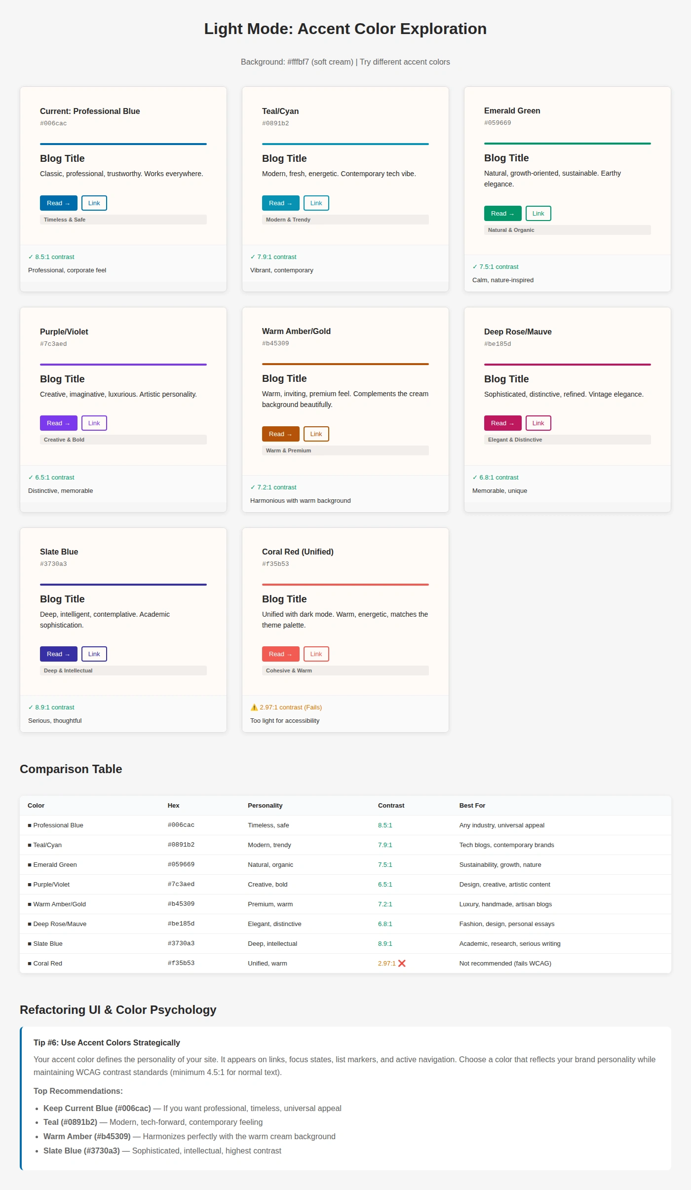
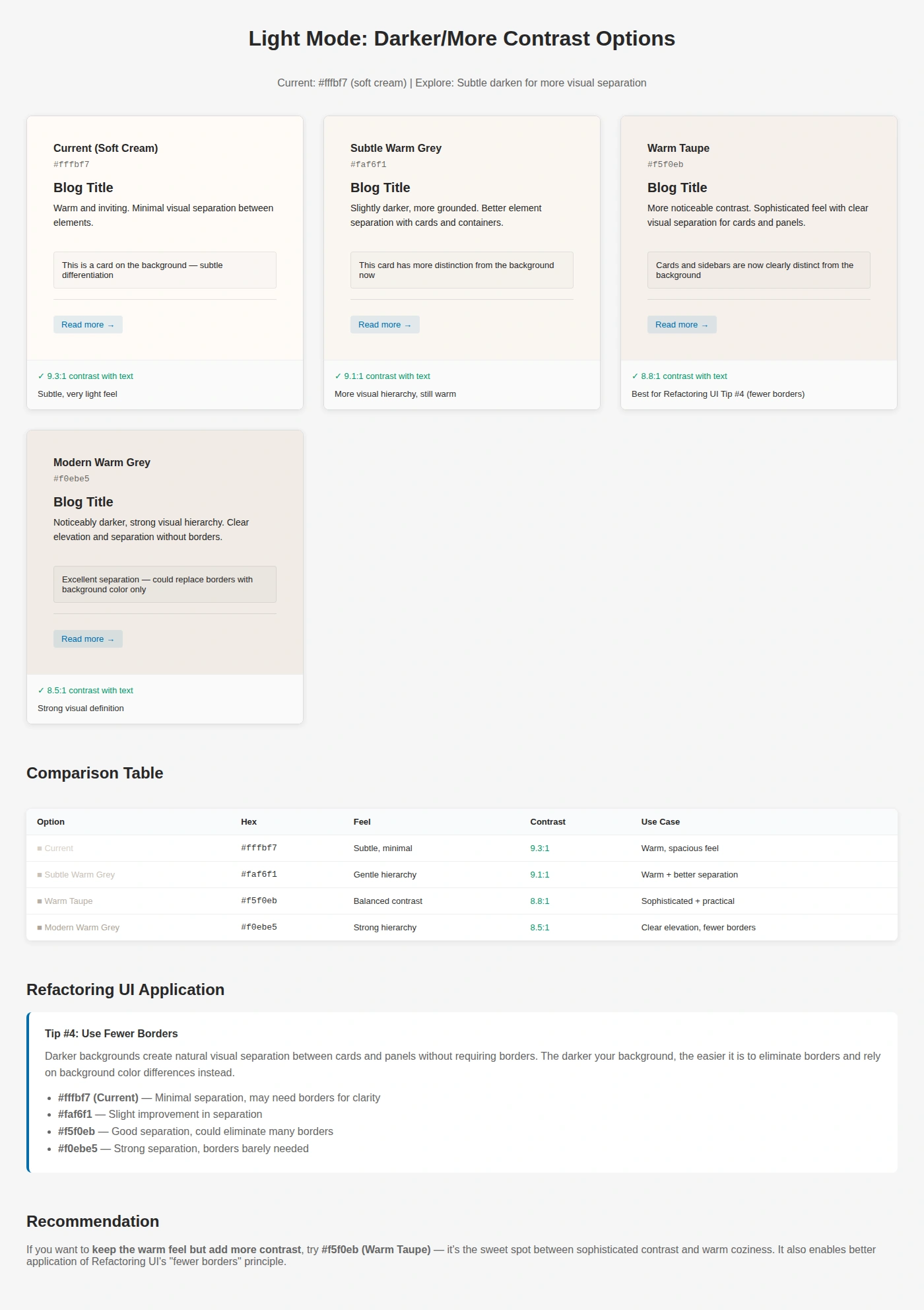
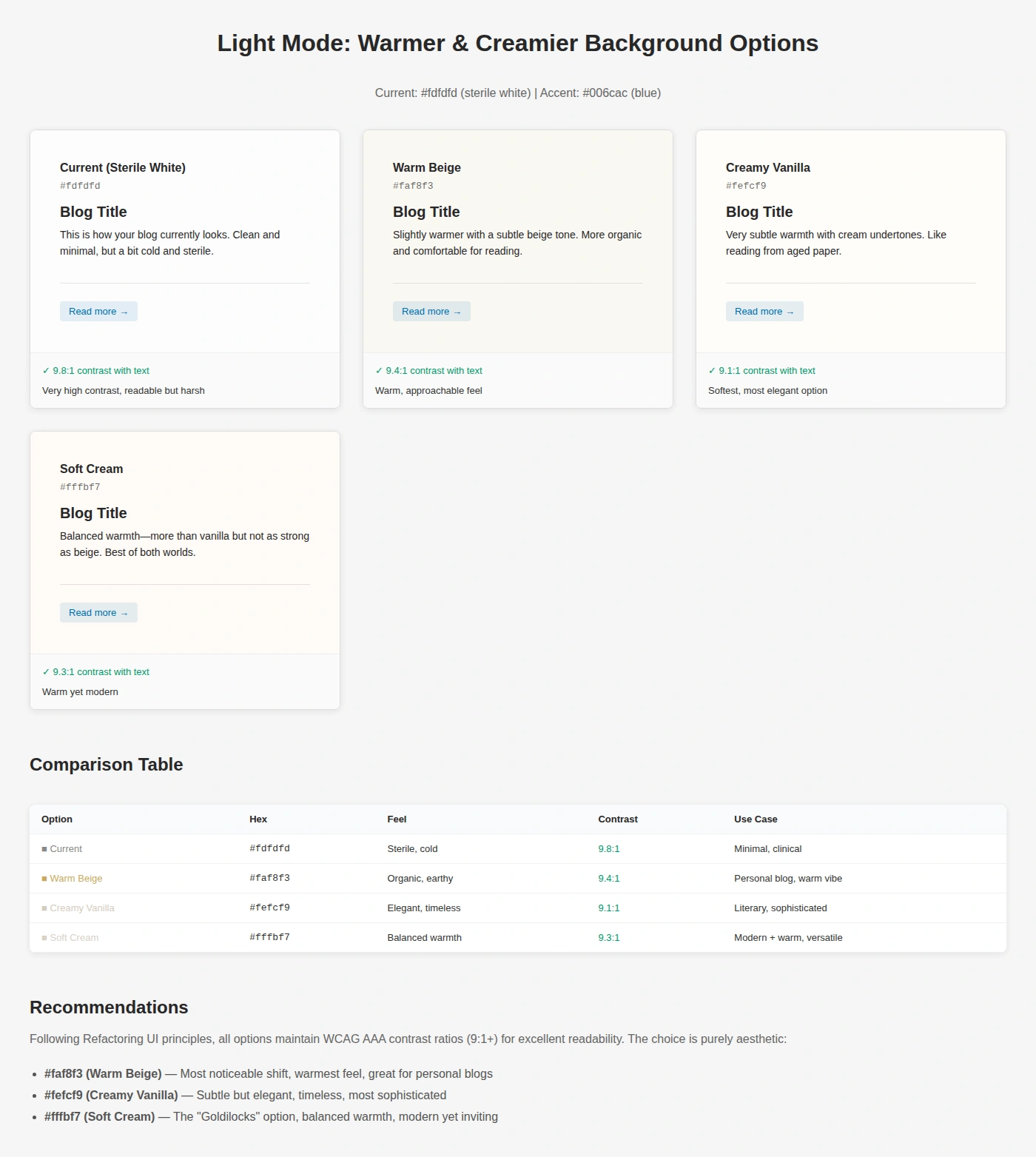
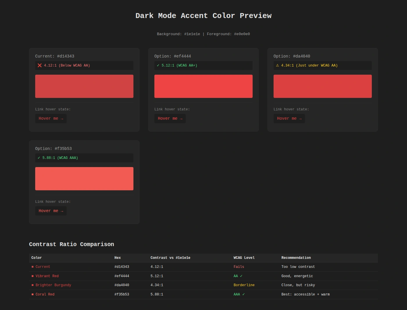
This was really useful for rapid prototyping of the colour schemes and made it really easy to pick something I liked, and then update the blog colour scheme to match. I went ahead and added theme configuration to the site, to make it easy to switch between styles (previously this was just in the global.css style from AstroPaper). In config.ts we define the theme colours for use in css:
// Base color palettes
const LIGHT_BASE: BaseColorPalette = {
  background: "#fffbf7", // Soft cream
  foreground: "#282728", // Dark charcoal
  muted: "#e6e6e6", // Light grey
  border: "#ece9e9", // Very light grey
} as const;

const DARK_BASE: BaseColorPalette = {
  background: "#1e1e1e", // Neutral dark grey
  foreground: "#e0e0e0", // Soft off-white
  muted: "#262626", // Lifted background for cards/code
  border: "#2c2c2c", // Subtle dividers
} as const;

// Accent color definitions
const LIGHT_ACCENTS = {
  roseAccent: { name: "Refined Rose", accent: "#be185d" },
  slateAccent: { name: "Slate Blue", accent: "#3730a3" },
  amberAccent: { name: "Warm Amber", accent: "#b45309" },
  // ...and more
} as const;

const DARK_ACCENTS = {
  coralAccent: { name: "Warm Coral", accent: "#f35b53" },
  roseAccent: { name: "Rose Pink", accent: "#fb7185" },
  slateAccent: { name: "Slate Blue", accent: "#818cf8" },
  // ...and more
} as const;
With a little bit of processing, I’m then able to swap between themes easily by modifying a couple of lines in the config file:
// Helper to combine base colors with accents
function createThemes<T extends Record<string, AccentDefinition>>(
  base: BaseColorPalette,
  accents: T
) {
  return Object.fromEntries(
    Object.entries(accents).map(([key, { name, accent }]) => [
      key,
      { ...base, name, accent },
    ])
  ) as { [K in keyof T]: Theme };
}

// Generate theme palettes
export const LIGHT_THEMES = createThemes(LIGHT_BASE, LIGHT_ACCENTS);
export const DARK_THEMES = createThemes(DARK_BASE, DARK_ACCENTS);

// Select active themes - change to any entry from LIGHT_THEMES or DARK_THEMES above
export const ACTIVE_LIGHT_THEME = LIGHT_THEMES.skyBlueAccent;
export const ACTIVE_DARK_THEME = DARK_THEMES.coralAccent;
Now that I was happy with the themes and being able to switch between them, I wanted to improve the dynamically generated og:image design. It’s not something I’d put too much thought into before, but as AstroPaper had already included this with Satori for layout and resvg-js, this was something that was quite easy to iterate on. Satori is something that lets you write React-like syntax and render it to SVG, while resvg-js renders those SVGs to a PNG for use as an image. Again applying the tips from the previously mentioned 7 Practical Tips blog post, I experimented with accent colours, eventually settling on a gradient top bar, and adding in a subtitle to the card.
The interesting bit was adding the gradient from the accent colour in the theme, and then fading out to the background colour:
{
  type: "div",
  props: {
    style: {
      width: "100%",
      height: BAR_HEIGHT_GRADIENT,
      background: `linear-gradient(90deg, ${theme.accent} 0%, ${theme.accent} 50%, ${hexToRgba(theme.accent, 0.5)} 75%, ${theme.muted} 100%)`,
      borderRadius: "3px",
      marginBottom: "20px",
    },
  },
},
Started looking into static site generators this week, ended up going super deep exploring with Claude and now I find myself comparing dynamically generated og:images for a blog that has no content (yet).
— Andreas Holley (@duk.im) 30 November 2025 at 13:18
[image or embed]
Satori made it really easy to experiment with the colours and design here, and I got to something I liked pretty quickly. Claude helped of course by generating examples for each of the accent colours from the themes for me, and making tweaks to the general layout from rough feedback I’d give it.
All in all, I found this AI-assisted design workflow to be a really good way to quickly try out lots of ideas, and push past any barriers that might have come from not knowing a particular framework, library, or tool. The colour scheme web pages specifically were really helpful to see how everything interacted in a real-world example, and Claude could churn them out pretty much as quickly as I could ask it to.